Play Mode styling reference
This reference describes Play Mode's HTML structure, CSS selectors, and default styles. The Style Editor, REST API, and MCP server all use the same project stylesheet. Reading that stylesheet returns only your custom rules, not Arcweave's built-in CSS.
The structure and examples below let you author styles without browser inspection. Use a browser to verify the rendered result, especially after changing layout or targeting a particular playback state.
Start with a small theme
This example changes the background, story text, and choices while keeping the default layout:
.prototype {
  background: #060c13;
}

.prototype__content {
  background: #111e28;
}

.prototype__text .editor .editor-content {
  color: #d4dedc;
  font-family: Georgia, serif;
  font-size: 22px;
  line-height: 1.6;
}

.prototype__option {
  --prototype-option-background: #1b2d37;
  --prototype-option-background-hover: #293b42;
  color: #e1bc79;
  border: 1px solid #415962;
}
Preserve any existing custom CSS when applying a new theme. A REST or MCP update replaces the complete custom stylesheet; see Save and verify styles.
Page structure
This browser capture shows the default styling on a Castle demo scene with two attached components. Cyan callouts identify the regions listed below; they are annotations, not built-in borders.
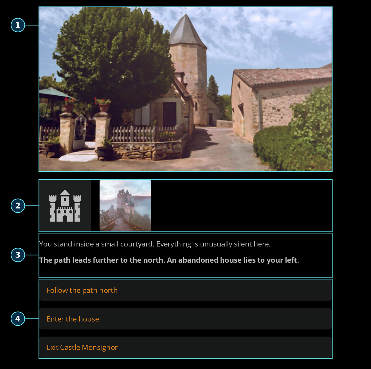
| Callout | Region | Selectors |
|---|---|---|
| 1 | Element image cover | .prototype__media img.single |
| 2 | Attached components | .prototype__components; individual covers use .comp--icon or .comp--image. |
| 3 | Story text | .prototype__text; style its text with .prototype__text .editor .editor-content. |
| 4 | Choices | .prototype__options contains the individual .prototype__option choices. |
The following is a simplified example of normal playback with an image cover and two choices. Utility classes and rich-text wrappers are omitted where marked. Navigation, the debugger, and the Style Editor sit outside the story root.
<div class="prototype">
  <!-- Play Mode navigation and other application UI -->
  <div class="prototype__main">
    <div class="prototype__root" id="el-38375689-9e4d-430e-954c-65205eb622fe">
      <!-- OverlayScrollbars inserts viewport/content wrappers here -->
      <div class="prototype__wrapper">
        <div class="prototype__content">
          <div class="prototype__header">
            <div class="prototype__media">
              <img class="single" src="..." />
            </div>
            <!-- Attached components, when present: see Media and components -->
          </div>
          <div class="prototype__body">
            <div class="prototype__text has-cover">
              <div class="editor-container">
                <!-- Additional rich-text wrapper -->
                <div class="editor read-only">
                  <div class="editor-content">
                    <div class="ProseMirror">
                      <p>The story text.</p>
                    </div>
                  </div>
                </div>
              </div>
            </div>
            <div class="prototype__options">
              <div class="prototype__option gold"><p>Enter the castle</p></div>
              <div class="prototype__option visited"><p>Return to camp</p></div>
            </div>
          </div>
        </div>
      </div>
    </div>
  </div>
</div>
Use descendant selectors such as .prototype__root .prototype__wrapper. Do not assume the wrapper is a direct child of the root: the scrollbar library adds wrappers at runtime. Treat library and utility classes as implementation details; prefer the named story classes below.
Main selectors
| Selector | Target |
|---|---|
.prototype | Outer Play Mode page, including surrounding controls. Useful for the page background. |
.prototype__main | Player area. |
.prototype__root | Scrollbar host for the current story element; also carries id="el-<element UUID>". |
.prototype__wrapper | Centers the story and supplies top spacing. |
.prototype__content | Story panel containing the header and body. |
.prototype__header | Element cover and attached component covers. |
.prototype__body | Story text and choices. |
.prototype__text | Text region; may also have has-cover, showArrow, or play-mode-editing. |
.prototype__text .editor .editor-content | Text box with explicit color, font size, line height, and padding. |
.prototype__text .editor .ProseMirror | Rich-text content, containing paragraphs, headings, links, and formatting tags. |
.prototype__options | Available choices. Hidden when there are no displayed choices. |
.prototype__option | A clickable div, not a native button. Normal playback puts label HTML directly inside it. |
.prototype__option.visited | A choice leading to an element already visited in the current playthrough. |
.prototype__option.gold | A choice with the corresponding connection color theme; see all theme classes. |
Use .prototype__option to style choice text, or .prototype__option p for its paragraphs. There is no separate label class in normal playback.
Media and components
The element cover appears inside .prototype__media in one of these forms:
| Cover | Rendered target | Styling notes |
|---|---|---|
| Image | img.single | .prototype__media img.single selects only the element cover. |
| Uploaded video | video.video-cover-player | The class is on the video itself; .video-cover-player video matches nothing. |
| YouTube | .embeded-youtube containing an iframe | Keep the spelling embeded-youtube. Size the wrapper and iframe as needed. |
| Icon | .prototype__media > .svg-icon-container containing an svg | Use the direct child selector to exclude component icons inside .prototype__media when there is no element cover. |
Attached component covers use .prototype__components grids. Their placement depends on the element cover:
- No element cover: the visible grid is inside
.prototype__media. A single component adds.singleto this grid. - Image cover: the visible grid is a sibling after
.prototype__media, with.prototype__components--pushed. - Icon or YouTube cover: the sibling grid has
.prototype__icon-pushed. - Video cover: the sibling grid has
.prototype__componentswithout either modifier.
An unused grid can remain in the DOM with inline display: none. Do not force hidden grids to display with !important.
Image components render as <img class="comp comp--image" style="aspect-ratio: ...">. Icon components render as <div class="comp comp--icon"> containing an SVG icon. A component without an assigned image uses its icon or the default icon. The grid after a cover also has a .flex-fix filler; it is not a component. Select .comp rather than every grid child.
For example, fit an existing element cover inside a shorter frame:
.prototype__media img.single {
  width: 100%;
  height: 40vh;
  object-fit: contain;
}
To show full component image silhouettes instead of cropping them into squares:
.prototype__components > .comp--image {
  object-fit: contain;
  background: transparent;
}
Edit content mode
While Edit content is enabled, the text region gets .play-mode-editing, and its editor wrapper gets .prototype-content-editor.is-content-editable.
Editable choices introduce a row wrapper and a rich-text editor. When reordering is available, the row also gets .is-option-edit-mode and a drag handle.
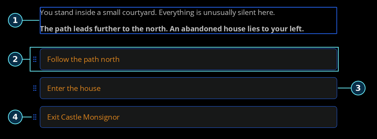
This cropped view shows the same scene with Edit content enabled. The blue edit outlines belong to the app; the cyan callouts are annotations.
| Callout | Region | Selectors |
|---|---|---|
| 1 | Editable story text | .prototype__text.play-mode-editing contains .prototype-content-editor.is-content-editable. |
| 2 | First choice row, including its handle | .prototype-option-row.is-option-edit-mode |
| 3 | Editable choice | .prototype__option.play-mode-editing |
| 4 | Drag handle | .prototype-option-handle |
The simplified markup for an editable choice is:
<div class="prototype__options">
  <div class="prototype-option-row is-option-edit-mode">
    <div class="prototype-option-handle"><!-- Drag handle --></div>
    <div class="prototype__option play-mode-editing">
      <!-- Drag edges and label editor wrappers -->
      <div class="prototype-option-editor">
        <!-- Rich-text editor: .editor .editor-content (see below) -->
      </div>
    </div>
  </div>
</div>
The actual editable markup has additional wrappers, and a hidden read-only copy of the rich text may remain. In the active text editor, .ProseMirror and .editor-content are classes on the same node. Continue to use descendant selectors from .editor, without assuming .editor-content > .ProseMirror. Styling .prototype__text .editor .editor-content works in both states and keeps story typography separate from the choice label editors.
Editable choices also capture their current background in an inline background declaration. If you change choice backgrounds in the Style Editor while editing content, leave and re-enter Edit content mode to see the updated background.
The app suppresses motion and hover effects on editable regions and pauses story navigation. Test the finished appearance with editing off, then confirm editing and drag handles are still usable. For positional choice selectors that handle both structures, see Style specific options.
Conditional content and the advance arrow
Choices reflect the current branch conditions and label evaluation, so their number and order can change. If exactly one available path has no label text, Play Mode uses a blinking advance arrow instead of a choice button. This also happens when branch conditions reduce several outgoing connections to one available path. See Continue to the next element.
The arrow is a border triangle on the last rich-text child, not a pseudo-element of the outer text region:
.prototype__text.showArrow .editor .ProseMirror > :last-child::after {
  border-top-color: #e1bc79;
  animation: none;
}
Video settings can delay the text and choices until the video ends. A missing text region or hidden choices container can therefore reflect playback state rather than a CSS error. CSS does not create choices, change their destinations, or change the condition that displays the arrow.
Missing translations can display fallback text and choice labels at reduced opacity, with a fallback notice before the text editor. Arcscript errors can add diagnostic boxes inside .prototype__text. These are playback states, not necessarily color or layout problems; scope formatting rules such as em to .prototype__text .editor .editor-content to avoid restyling the notice.
Layout defaults
These are built-in values before custom CSS. More specific rules, rich-text formatting, and inline styles can affect the final result.
| Target | Default behavior |
|---|---|
.prototype | Relative positioning, full available height, black background, hidden overflow. |
.prototype__main | Horizontal flex container, full height, hidden overflow. |
.prototype__root | Flex column with flex: 1, max-height: 100%, and vertical scrolling managed by OverlayScrollbars. |
.prototype__wrapper | Flex container, centered horizontally, min-height: 100%, padding-top: 40px. |
.prototype__content | width: 100%, max-width: 860px, min-height: 100%, padding: 20px, font-size: 20px, overflow-x: hidden. |
.prototype__body | white-space: pre-wrap. |
.prototype__body .editor .editor-content | color: #bcbcbc, font-size: 20px, line-height: 1.5, padding: 20px 0 40px. |
| Rich-text wrappers | .editor-content and the read-only editor also have overflow rules; paragraphs have their own spacing. Account for these when building a separately scrolling dialogue box. |
.prototype__media | Wrapping flex container. Image covers preserve their aspect ratio within maximum width/height constraints. |
.prototype__components | Grid with width: 100%, margin-top: 3%, and a 3% column gap. Column count is set inline. |
.prototype__components > .comp | Full cell width/height, object-fit: cover, dark background, 4px corners. Image aspect ratio is set inline. |
.prototype__option | padding: 15px 20px, margin-bottom: 20px, border-radius: 8px, line-height: 1.5, white-space: pre-wrap, and a background transition. |
The component grid has one column per attached component when there is no element cover. With a cover it uses at least five columns (max(component count, 5)). A lone image component without an element cover uses its natural aspect ratio; otherwise image components use a square aspect ratio.
Both grid-template-columns on the grid and aspect-ratio on component images are inline styles. If you need to replace those properties, use a narrowly targeted override:
.prototype__components {
  grid-template-columns: repeat(2, minmax(0, 1fr)) !important;
}

.prototype__components > .comp--image {
  aspect-ratio: auto !important;
  height: 180px;
  object-fit: contain;
}
Switching the grid to display: flex is another layout choice: its inline grid column definition then has no effect. Avoid blanket !important rules, especially on visibility or edit-mode behavior.
Choice background variables
The built-in stylesheet defines these on each .prototype__option:
| Variable | Default |
|---|---|
--prototype-option-background | #171818 |
--prototype-option-background-hover | #292d2d |
Override them on .prototype__option, as in the starter theme. Setting them only on a parent does not replace the declarations on each choice. A custom background without a matching hover rule can still be replaced by the built-in :hover background.
Player scrollbars
The root's current scrollbar library creates a [data-overlayscrollbars-viewport] descendant and separate .os-scrollbar controls. Styling .prototype__root::-webkit-scrollbar does not style those controls. Change their thumb colors with the library's variables:
.prototype__root .os-scrollbar {
  --os-handle-bg: #64748b;
  --os-handle-bg-hover: #94a3b8;
  --os-handle-bg-active: #cbd5e1;
}
The built-in values are #242829 for the normal thumb and #424a4c for hover/active. A separately scrolling region that you add with overflow: auto, such as the visual-novel dialogue box, uses native scrollbars instead; style that region with scrollbar-color and scrollbar-width.
CSS scope and precedence
Custom CSS is inserted into a document-level stylesheet while Play Mode is mounted. Arcweave does not automatically scope your selectors to the story. Bare body, button, .editor, .ProseMirror, or svg rules can also affect surrounding application UI. Use the story selectors above, or an element ID, to limit their reach. Define your own theme variables on a story container rather than global :root.
Custom CSS appears after the built-in styles, but normal CSS specificity, inheritance, inline styles, and !important still apply. For example, changing color or font-size on .prototype__content does not override the explicit values on its descendant .editor-content. Target .prototype__text .editor .editor-content for those properties. Rich-text headings, links, or formatted spans may need a further targeted rule.
Default overflow-x: hidden on the story panel and scrolling wrappers matter for absolute positioning. Establish a containing block deliberately, remove conflicting size/padding constraints, and bound separately scrolling dialogue and choice regions. Check short screens as well as narrow ones; the visual novel tutorial demonstrates this layout.
Target one element
Use the element's UUID from the API/MCP element record or Properties → Details → Element ID. The player maps it directly to id="el-<uuid>"; no browser lookup is needed.
For UUID 38375689-9e4d-430e-954c-65205eb622fe, the selector is:
#el-38375689-9e4d-430e-954c-65205eb622fe
  .prototype__text
  .editor
  .editor-content {
  color: #e2e8f0;
  font-family: 'Courier New', monospace;
  font-size: 18px;
}
The UUID is distinct from the element's user-defined custom ID and the project's URL hash (projectId in MCP). Prefix a raw UUID with el- once; a DOM ID copied from the browser already contains that prefix.
Component and connection UUIDs are not exposed as corresponding DOM IDs or data attributes. Do not invent #component-<uuid>, #connection-<uuid>, or [data-id="..."] selectors. You can scope to the current element and then target component types, choice themes, visited state, or visible choice positions. Positions are not stable identifiers across branch evaluation or reordering.
Asset URLs
Prefer attaching an asset as an element cover or component cover, then styling its rendered image. Arcweave supplies the image URL and updates it as the current element changes.
Asset metadata reads through REST/MCP return a stored file name, not a persistent public URL for CSS. The MCP file-download tool returns a temporary transfer URL. An agent using those tools should use managed covers, or a persistent public URL supplied by the user or hosted under their control. Do not construct a URL from file.
If you already have a persistent Arcweave media delivery URL, use it unchanged and verify that the intended players can access it. See Asset delivery URLs.
The authenticated REST file-download endpoint requires an API-key header, which CSS requests cannot supply. MCP upload/download transfer URLs expire and must not be saved in a stylesheet. Never embed an API key in CSS or a URL. Verify external fonts and images in the public player as well as your editing session.
Save and verify styles
For the REST API and MCP tools:
- Read the current custom CSS and retain a copy for rollback.
- Modify it while preserving unrelated rules. Re-read the saved CSS immediately before updating; if it changed, apply your edits to that latest value. Send the complete updated stylesheet; updates do not append rules.
- Read it back to confirm what was stored. Passing
""clears all custom styling. - Reload an already-open Play Mode tab, or click Play in the editor to open a new tab, which loads fresh settings. Restarting the story or returning to Play Mode through same-tab navigation does not fetch fresh settings. External CSS updates are not broadcast to existing players.
- Verify the appearance and story navigation. A successful save confirms storage, not CSS syntax, matching selectors, or usable layout. The Style Editor's validation and live preview are separate from REST/MCP string validation.
Saves replace the entire stylesheet without conflict detection: the latest save wins. An old Style Editor tab can overwrite an agent's changes, and an agent can overwrite a newer manual save. Coordinate edits; re-reading before a write reduces this risk but does not lock the stylesheet. After an external update, retain any unsaved local edits, reload the Style Editor tab, and reapply them to the fresh CSS before saving there.
CSS API/MCP writes do not create project command-history entries. Restore your saved original by sending it as the complete stylesheet again, then reload.
Check a typical scene and the cases affected by your change: long dialogue, many long choices, a single unlabelled path, visited/themed choices, each cover type you use, components with and without a cover, and edit mode. Test desktop, a narrow mobile viewport, and a short landscape viewport. Confirm that text and the last choice remain reachable by scrolling and that navigation controls remain usable.
If a browser is unavailable, you can verify the saved stylesheet and check selectors against this reference. Report that visual verification is still outstanding rather than treating a successful tool response as proof of appearance.