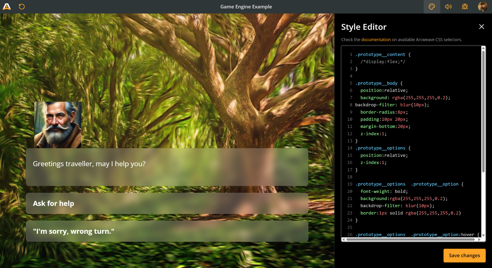
Style Editor
Arcweave allows you to customize the appearance of the Play Mode interface using custom CSS via the Style Editor.
✅ The Tutorials section includes two tutorials on CSS: Arcweave CSS basics and visual novel css.
Access the Style Editor
To access the Style Editor:
- Enter Play Mode by clicking the play icon.
- Click the Style Editor icon (palette icon) in Play Mode's top bar.
Use the Style Editor
The Style Editor panel provides a dedicated environment for writing and managing your custom CSS:
- Interface: The editor features CSS syntax highlighting and line numbers for easier code readability and navigation. The panel itself is resizable; you can drag its left edge to adjust the width.
- Writing CSS: Enter your custom CSS rules in the editor.
- Real-time Validation: As you type, the editor automatically validates your CSS.
- If errors are detected, an error count and an alert icon (!) will appear at the bottom of the panel.
- Clicking the error count/icon area will display detailed error messages (e.g., "Line 5: Invalid property name").
- The Save changes button will be disabled until all validation errors are resolved.
- Live Preview: Valid CSS rules are reflected in the Play Mode window in real-time, allowing you to see the effects of your changes instantly.
- Saving: Once you are satisfied and there are no validation errors, click the Save changes button to persist your custom styles. Your styles will be applied whenever you or others run this project in Play Mode.
Keyboard Shortcuts
The following keyboard shortcuts are available within the Style Editor:
| Shortcut | Action |
|---|---|
Tab | Indent the current line (inserts 2 spaces) |
Shift + Tab | Outdent the current line (removes 2 spaces) |
Available CSS Selectors
You can target various parts of the Play Mode UI using specific CSS classes. Here are some of the commonly used selectors based on the underlying structure:
| Selector | Description | Notes |
|---|---|---|
.prototype | The outermost container for the entire Play Mode interface. | Applied higher up in the application structure. |
.prototype__main | The main content area, excluding potentially fixed elements. | |
.prototype__root | A primary wrapper within prototype__main. | Scrollable. Contains the element-specific div. |
#el-[element-id] | The div specific to the currently displayed element. | e.g. el-38375689-9e4d-430e-954c-65205eb622fe |
.prototype__wrapper | An additional wrapper inside the element-specific div. | Contains .prototype__content. (Note: .prototype__options is sibling to .prototype__content if following older structures, or within if structure changed) |
.prototype__content | The container holding the element's visual parts and text. | Contains .prototype__header, .prototype__body, and .prototype__options. |
.prototype__header | Container for media (cover, icon, components without cover). | |
.prototype__body | Container for the element's main text content area. | Now contains a .prototype__text div that wraps the editor. |
.prototype__text | Direct wrapper for the rich text editor. | Found inside .prototype__body. Gets the .showArrow class when applicable. |
.prototype__text .editor .editor-content | The bounding box for the element's text content. | Styles here affect the entire text block (e.g., background, padding). Contains .ProseMirror. |
.prototype__text .editor .ProseMirror | The direct container of the element's formatted text (paragraphs, links, etc.). | Use this selector to target specific HTML tags within the text, like p, a, strong. E.g., .prototype__text .editor .ProseMirror p { ... }. |
.prototype__media | Holds the cover image, embed, or icon. | |
.prototype__components | Grid container for attached components. | |
.prototype__options | The container holding the clickable choice/option buttons. | |
.prototype__option | An individual choice button. | Contains the option text directly (use v-html). |
.prototype__text.showArrow | Styles the text container when the single-path arrow is visible. | The arrow is typically an ::after pseudo-element on this div. |
Notes:
- To style the text of an option button, target
.prototype__optiondirectly (e.g.,.prototype__option { color: blue; }or.prototype__option p { font-weight: bold; }). There isn't a separate label class. - Always use your browser's developer tools (F12) to inspect the elements in Play Mode and confirm the exact, current class names and structure you need to target.
Example
Here's an example reflecting some of the default styles in Play Mode. You can use this as a starting point for your own customizations:
@import url('https://fonts.googleapis.com/css2?family=Lora:ital,wght@0,400..700;1,400..700&display=swap');

.prototype__wrapper {
  padding-top: 0px;
}

.prototype__content {
  display: flex;
  flex: 1;
  flex-flow: row-reverse;
  max-width: 100%;
  padding: 0;
}

.prototype__header {
  display: flex;
  flex-basis: 50%;
}

.prototype__body {
  flex: 1;
  padding: 2rem;
  font-family: 'Lora', serif;
}

.prototype__text .editor .editor-content {
  font-size: 22px;
}

.prototype__media {
  flex-flow: column;
  flex: 1;
}

.prototype__media img {
  object-fit: cover;
  width: 100%;
  height: 100%;
}

.prototype__components {
  grid-gap: 0;
  height: 100%;
}

.prototype__components--pushed {
  display: none;
}

.prototype__components.single > .comp {
  background: #1d1f1f;
}

.prototype__option {
  border-radius: 0;
  border: 1px solid #292d2d;
  background: none;
}

@media (max-width: 767px) {
  .prototype__wrapper {
    padding-top: 40px;
  }
  .prototype__content {
    flex-flow: column;
  }
  .prototype__body .editor .editor-content {
    padding: 0 0 40px;
  }
  .prototype__header {
    flex-basis: 0;
  }
}
Target elements
Beyond the general classes, you can apply styles to specific elements shown in Play Mode. Each element's content is wrapped within a div that has a unique id attribute, typically starting with el-.
To find an element's ID:
- Navigate to the element in Play Mode.
- Open your browser's developer tools (usually by pressing F12).
- Use the element inspector tool to select the main content area of the element.
- Look for a
divelement that has anidattribute likeid="el-abcdef12345...". Copy this ID (including theel-prefix).
You can then use this ID in your CSS selectors with the standard ID selector (#):
/* Style the body text only for a specific element */
#el-your-specific-element-id .prototype__text .editor {
  font-family: 'Courier New', monospace;
  font-size: 18px;
}

/* Style the options only for a specific element */
#el-your-specific-element-id .prototype__option {
  background-color: darkred;
}
This allows for highly granular control over the appearance of individual parts of your story.
ℹ️ Experiment with different CSS rules and selectors to achieve your desired look and feel. Use your browser's developer tools (usually by pressing F12) while in Play Mode to inspect elements and discover the most specific selectors for your needs.