Visual novel CSS guide
Visual novels are one of the most popular storytelling formats in interactive fiction. With their full-screen backgrounds, character sprites, and dialogue boxes, they create an immersive reading experience that draws players into your story.
This tutorial helps you achieve this polished look in Arcweave's Play Mode using the Style Editor and some advanced CSS. It teaches you how to:
- Set up your project up with element covers and character components
- Access the Style Editor
- Turn your element covers to full-screen background images for each scene
- Create character components and position them as sprites at the bottom of the screen
- Create a stylish dialogue box with scrollable text
- Style choice buttons and place them above your dialogue
- Make everything responsive for mobile devices
- Style specific words and paragraphs for emphasis
- Style specific options
- Experiment further with advanced tips
- Troubleshoot common problems
Set up your project
The visual novel interface has specific visual parts. Before diving into CSS, you must first set your Arcweave project up in a way that these parts get represented as follows:
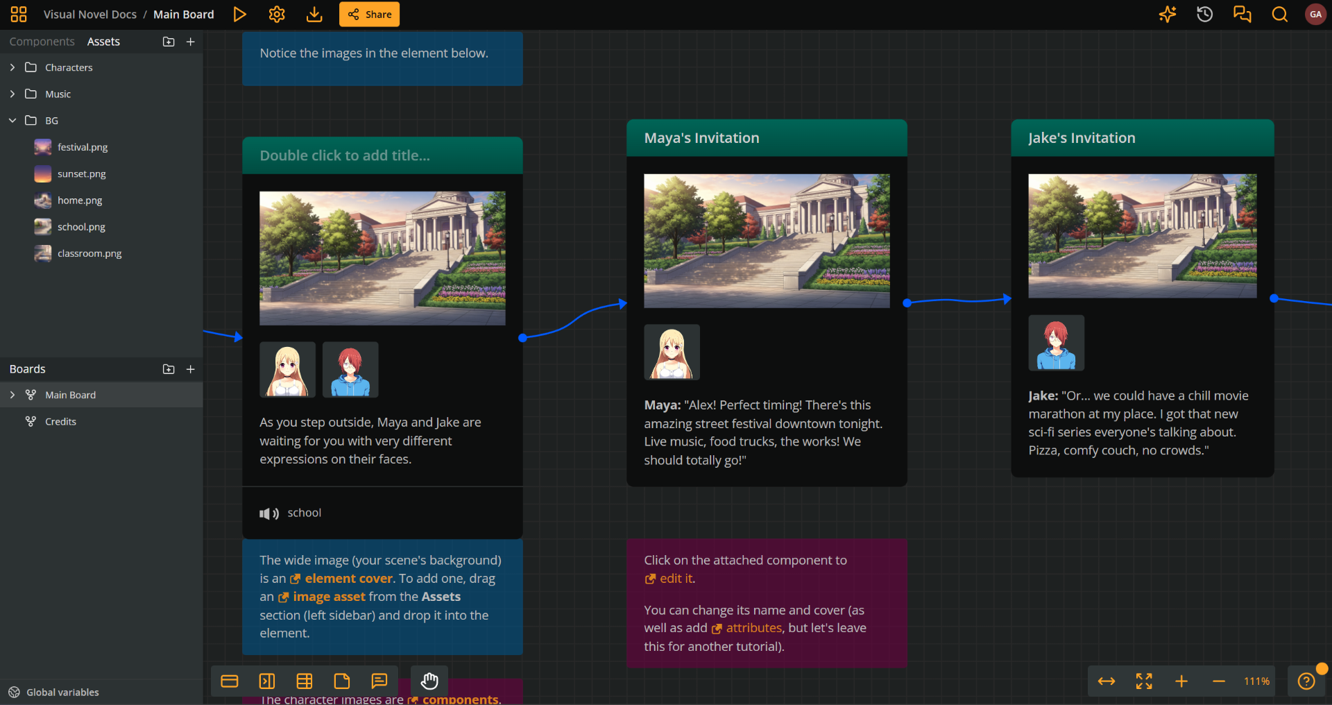
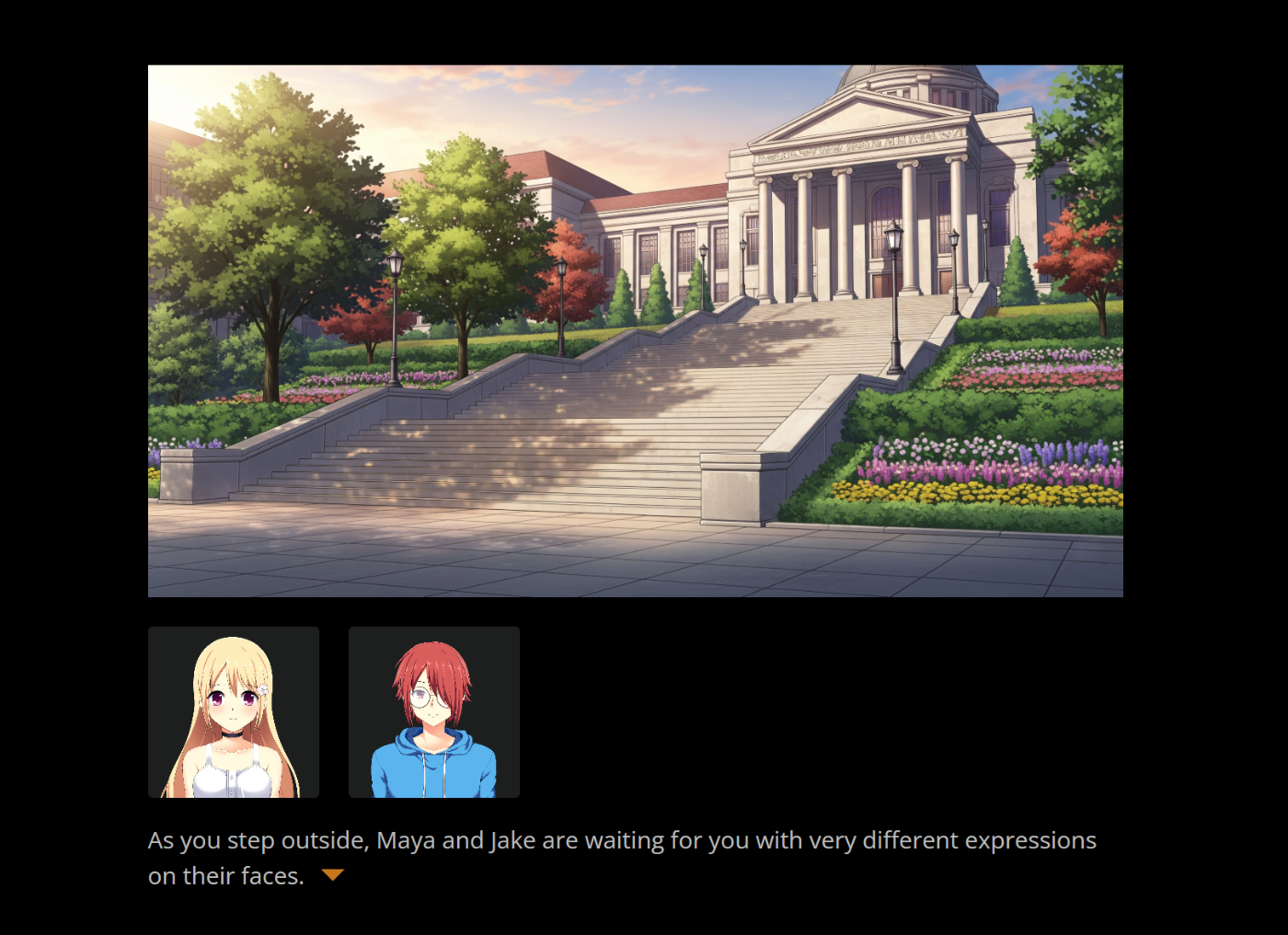
- Scene backgrounds: The scenic backdrop for each scene, in full screen. In the Arcweave project, these will be represented by element covers.
- Character sprites: The characters that appear or speak in a dialogue scene. They are represented by components and their cover images.
- Dialogue box: The text box where the game's dialogue appears in rich text. If the content is long, a scrollbar appears.
- Option buttons: The player choices. In Arcweave, these are created with connections and labels
Access the Style Editor
In order to type your CSS code, you first need to access Arcweave's Style Editor.
To open the Style Editor:
- Open your project and click the Play button (▶️) in the top menu.
- In Play Mode, click the Style Editor icon (🎨 palette icon) in the top bar.
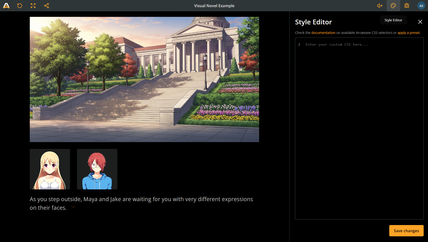
The Style Editor shows you the current CSS and lets you write custom styles that will apply to your entire Play Mode.
Scene backgrounds
Background assets
As these are the backdrops for your scenes, you must use hi-resolution images that will look good in full screen; a width of 1920 pixels is good.
Feel free to study and replicate the background assets used in the Visual Novel Example (sized 2816 x 1536 pixels).
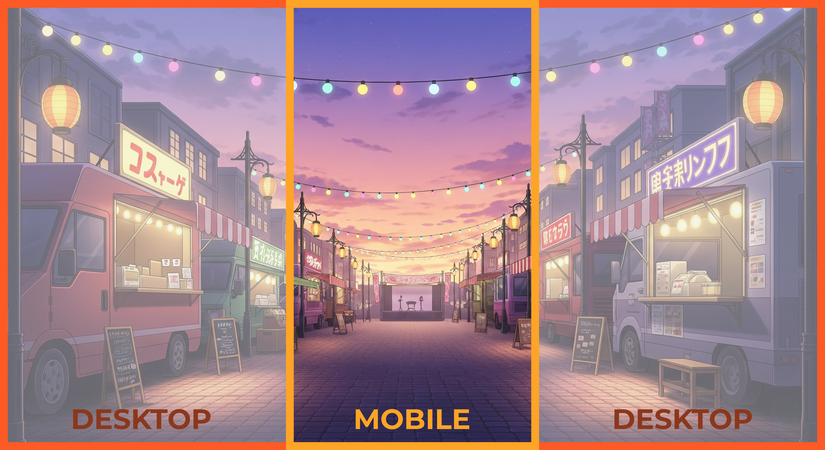
⚠️ Responsiveness: Keep in mind that players that access your game on mobile devices will have only see a vertical section of your background. Make sure the essential bits are in their central areas, as the player may miss the areas on the left and right.
Element covers
In the Arcweave project, scene backgrounds will be represented by element covers.
Attach the desired background on the elements of your scene as covers.
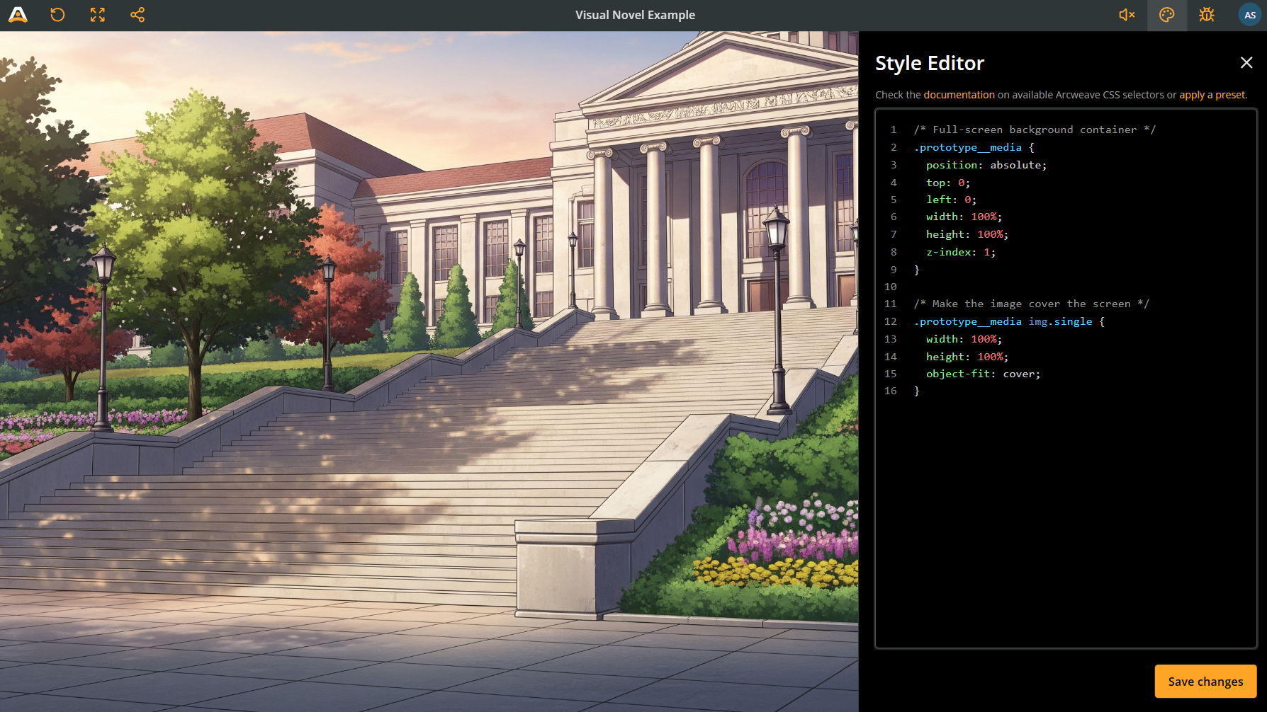
Background CSS
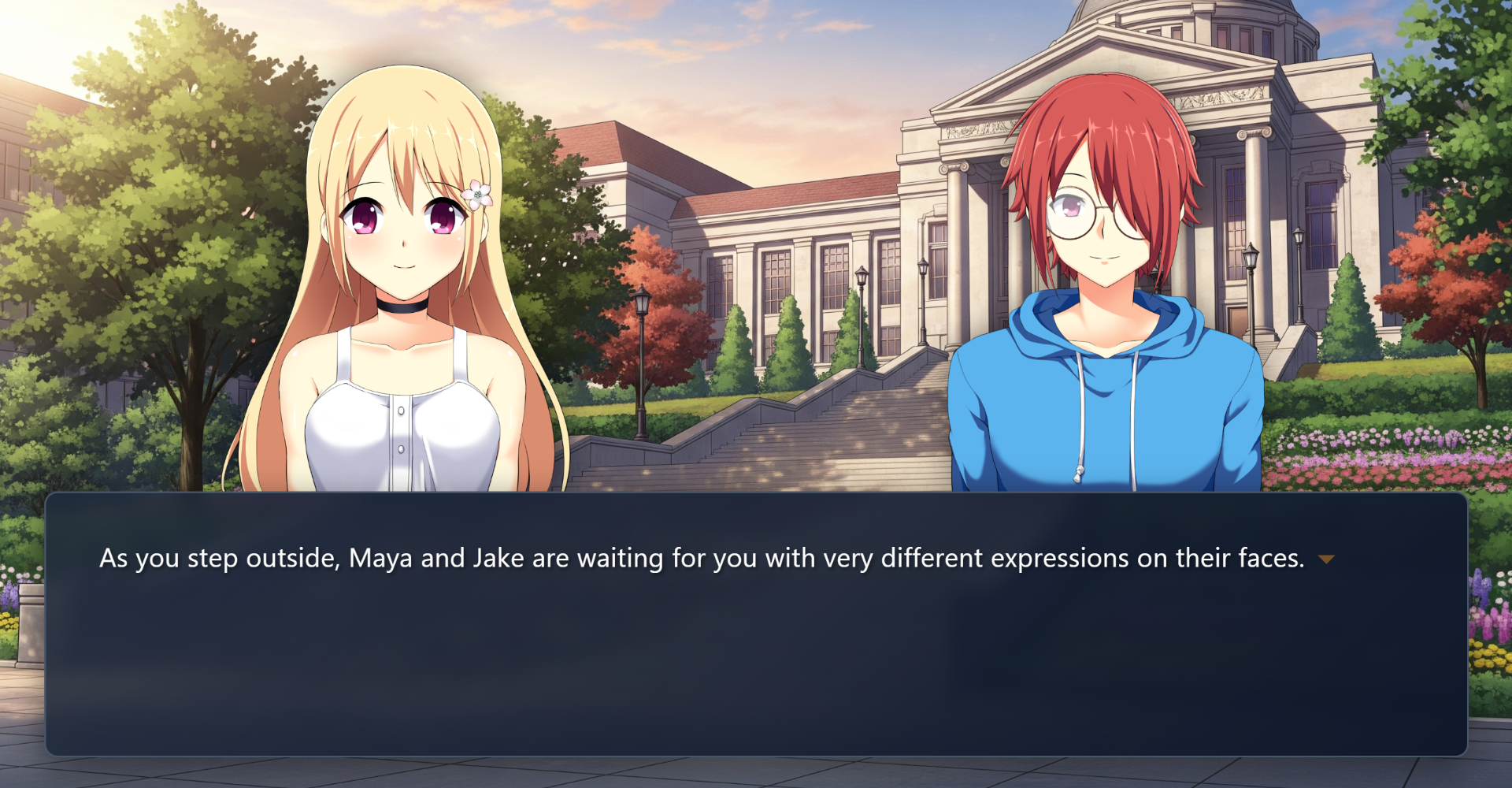
By default, element covers and attached components render as shown in the picture below.
Use the code snippet below, to make element covers fill the entire screen in Play Mode:
Click to expand CSS code extract
/* Full-screen background container */
.prototype__media {
  position: absolute; /* lets you place the image anywhere */
  top: 0;
  left: 0;
  width: 100%; /* makes image fill the screen in width */
  height: 100%; /* makes image fill the screen in height */
  z-index: 1; /* puts it in the background, behind characters and dialogue */
}

/* Make the image cover the screen */
.prototype__media img.single {
  width: 100%;
  height: 100%;
  object-fit: cover;
}
Your background images now should fill the whole width and height of the Play Mode window.
Character sprites
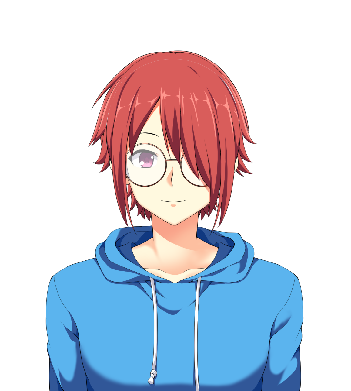
Character assets
For the character sprites, use PNG portraits with transparent backgrounds. See the character assets of the Visual Novel Example, like the one below.
Character components
Use components to signify dialogue speakers and characters present in a scene. Add covers, add the images you added to your project's assets, above.
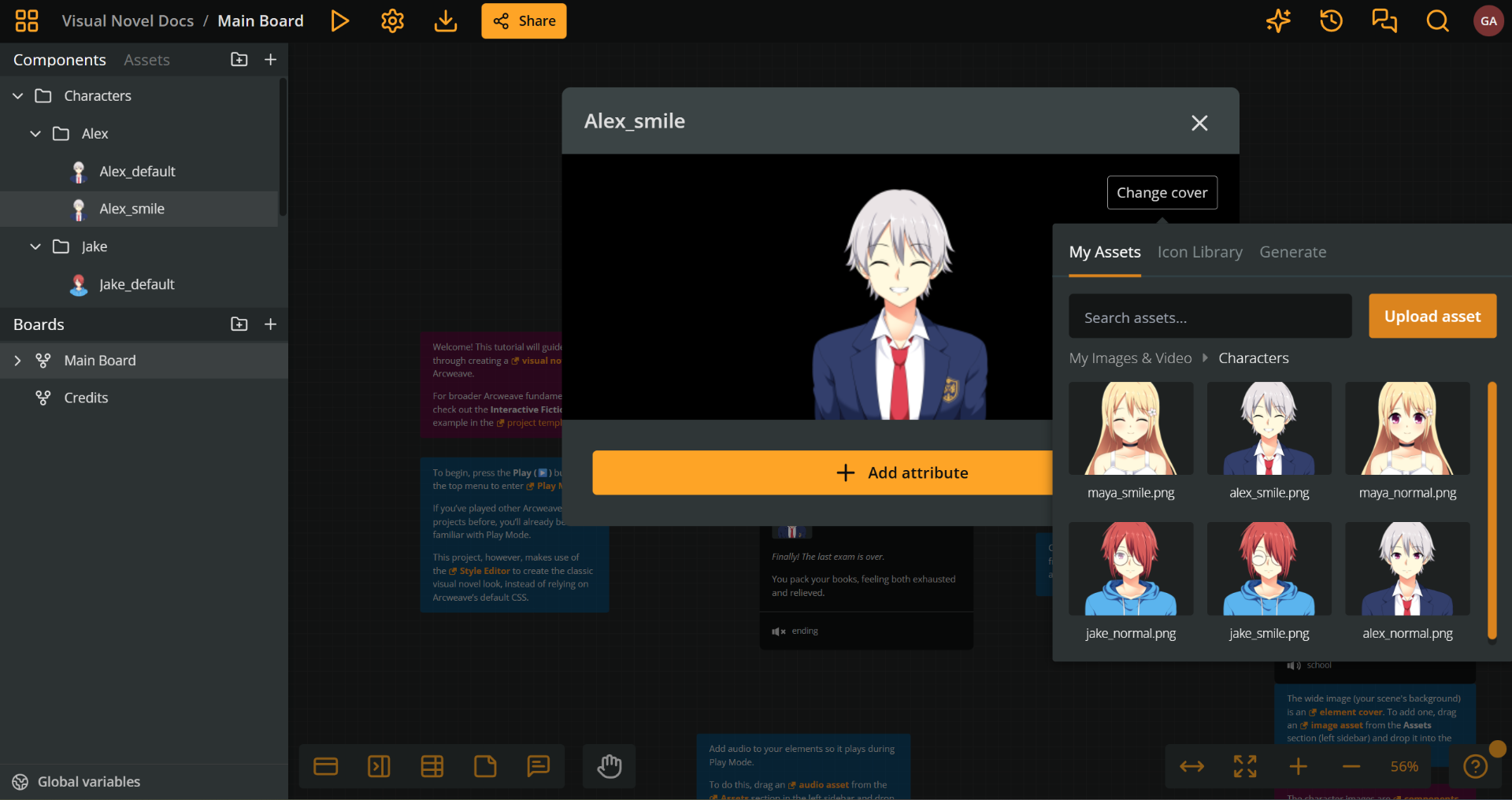
Then, attach the character components to the elements they appear.
Character emotions
To have a character appear with a variety of facial expressions, you need to do both of the following:
- Upload a different asset (PNG image) for each facial expression.
- Create a different component for each facial expression.
- Attach the component with the desired expression to each element of the character's scene.
Character CSS
Use the code snippet below to make character sprites appear at the bottom of the screen, standing above the dialogue box:
Click to expand CSS code extract
/* Character container */
.prototype__components {
  position: absolute; /* lets you place the sprite image anywhere */
  bottom: 350px; /* positions characters above the dialogue box */
  left: 0;
  right: 0;
  height: 60vh; /* makes characters take up 60% of screen height */
  display: flex;
  align-items: flex-end; /* aligns characters to the bottom */
  z-index: 2;
  padding: 0 5%;
}

/* Character sprite styling */
.prototype__components .comp {
  height: 100%;
  background: none;
  object-fit: contain;
  object-position: bottom; /* keeps feet anchored at the bottom */
  filter: drop-shadow(
    0 0 20px rgba(0, 0, 0, 0.5)
  ); /* adds a subtle shadow for depth */
}
✅ If you have multiple character components attached to an element, they'll automatically arrange side-by-side thanks to
display: flexin.prototype__components.
💡 Customization tip: Adjust
bottom: 350pxto change how high characters appear. Try400pxfor more space or300pxfor less.
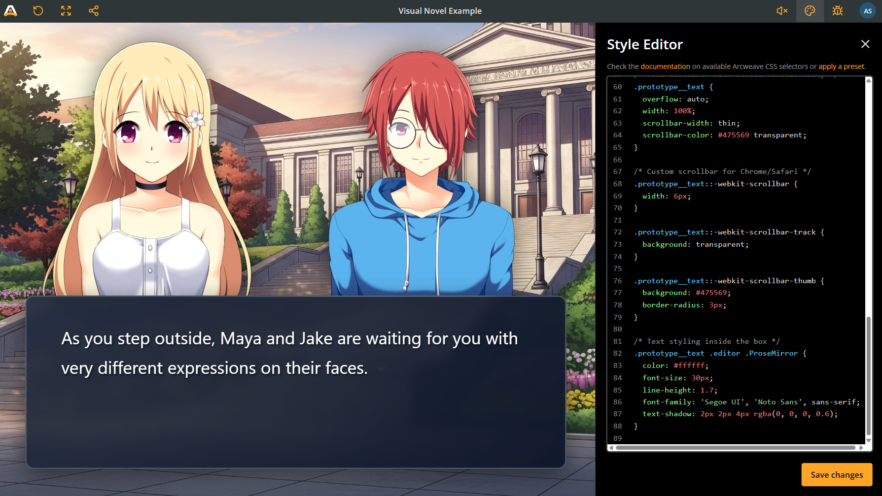
Dialogue box
The dialogue box is where your text appears. If the text is long, a scrollbar appears, so the player can read all of it.
Click to expand CSS code extract
/* Dialogue box container */
.prototype__body {
  position: absolute;
  bottom: 50px; /* positions dialogue box near the screen bottom */
  left: 50px;
  right: 50px;
  height: 300px;
  background: linear-gradient(
    135deg,
    rgba(30, 41, 59, 0.85) 0%,
    rgba(15, 23, 42, 0.98) 100%
  ); /* creates a semi-transparent gradient */
  border: 2px solid #475569;
  border-radius: 15px; /* rounds the corners */
  z-index: 3;
  padding: 25px 60px;
  backdrop-filter: blur(10px); /* blurs the background behind the box */
  box-shadow: 0 10px 40px rgba(0, 0, 0, 0.5);
  display: flex;
}

/* Text container with scroll functionality */
.prototype__text {
  overflow: auto; /* important: it enables scrolling when text is long */
  width: 100%;
  scrollbar-width: thin; /* style the scrollbar to match your theme */
  scrollbar-color: #475569 transparent;
}

/* Custom scrollbar for Chrome/Safari*/
.prototype__text::-webkit-scrollbar {
  width: 6px;
}

.prototype__text::-webkit-scrollbar-track {
  background: transparent;
}

.prototype__text::-webkit-scrollbar-thumb {
  background: #475569;
  border-radius: 3px;
}

/* Text styling inside the box */
.prototype__text .editor .ProseMirror {
  color: #ffffff;
  font-size: 30px;
  line-height: 1.7;
  font-family: 'Segoe UI', 'Noto Sans', sans-serif;
  text-shadow: 2px 2px 4px rgba(0, 0, 0, 0.6); /* makes text more readable */
}
⚠️ The
overflow: autoproperty ensures players can always read all the text. Without it, long dialogue will be cut off.
Option buttons
According to the classic visual novel style, player choices should appear above the dialogue box.
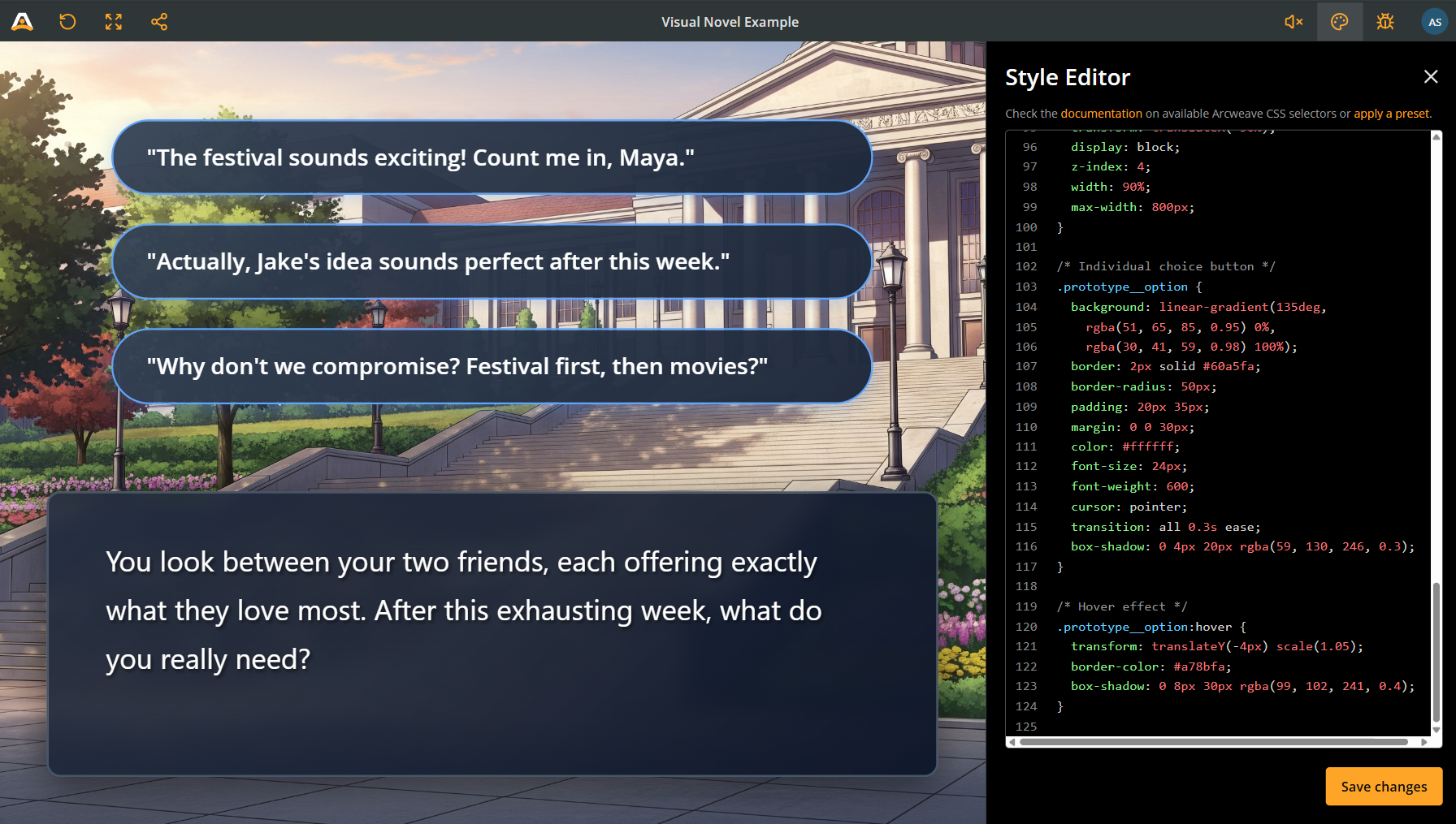
Style the option buttons with the following CSS code:
Click to expand CSS code extract
/* Options container */
.prototype__options {
  position: absolute;
  bottom: 360px; /* places buttons just above the dialogue box */
  left: 50%;
  transform: translateX(-50%); /* centers them horizontally */
  display: block;
  z-index: 4;
  width: 90%;
  max-width: 800px;
}

/* Individual choice button */
.prototype__option {
  background: linear-gradient(
    135deg,
    rgba(51, 65, 85, 0.95) 0%,
    rgba(30, 41, 59, 0.98) 100%
  );
  border: 2px solid #60a5fa;
  border-radius: 50px; /* creates pill-shaped buttons */
  padding: 20px 35px;
  margin: 0 0 30px;
  color: #ffffff;
  font-size: 24px;
  font-weight: 600;
  cursor: pointer;
  transition: all 0.3s ease; /* smoothly animates hover effects */
  box-shadow: 0 4px 20px rgba(59, 130, 246, 0.3);
}

/* Hover effect: makes buttons lift up when you mouse over them */
.prototype__option:hover {
  transform: translateY(-4px) scale(1.05);
  border-color: #a78bfa;
  box-shadow: 0 8px 30px rgba(99, 102, 241, 0.4);
}
Mobile responsiveness
To make the game responsive for mobile devices, add the CSS query @media (max-width: 1000px). Make sure all the code that follows is enclosed in the query's curly brackets.
Click to expand CSS code extract
@media (max-width: 1000px) {
  /* Adjust character positioning */
  .prototype__components {
    bottom: 150px;
    height: 50vh;
  }

  /* Smaller dialogue box */
  .prototype__body {
    bottom: 20px;
    left: 20px;
    right: 20px;
    height: 150px;
    padding: 15px 30px;
  }

  /* Smaller text */
  .prototype__text .editor .ProseMirror {
    font-size: 20px;
  }

  /* Adjust options */
  .prototype__options {
    bottom: 180px;
  }

  .prototype__option {
    font-size: 18px;
    padding: 12px 30px;
  }
}
Style specific text
Here's where things get really interesting! You might want to emphasize certain words—like a character's name in a different color, important clues in bold and red, or sound effects in a stylized font.
The Challenge: Arcweave doesn't let you inject custom HTML classes directly into your text.
The Solution: We can "hijack" the formatting tools that Arcweave already provides.
How it works
When you format text in Arcweave's editor (italic, bold, underline), it generates standard HTML tags:
- Italic creates
<em>tags - Bold creates
<strong>tags - Underline creates
<u>tags
We can target these tags with CSS and override their default appearance. The key is to use the element ID to make sure we only affect specific elements, not every italic word in your entire story.
Find element IDs
There are two easy ways to find an element's ID:
Method 1: Using the debugger (recommended)
- Enter Play Mode
- Click on Debug in the top menu
- Navigate to the element you want to style
- Look at the Current Element section - you'll see the ID listed there
- Copy the ID (it looks like
el-cb35db92-3c07-41bf-9c45-580ad6b891b4)
Method 2: From the Editor
- In your project, right-click the element you want to style
- Select Properties
- The element ID is shown in the “Details” tab
- Copy the ID
Step-by-step process
1. Format text in the editor
Go to your element and edit it:
- Highlight the word or phrase you want to style
- Apply a format: Italic, Bold, or Underline
- This creates the HTML tag we'll target with CSS
2. Write the CSS
Now in the Style Editor, target that specific formatted text:
Click to expand CSS code extract
/* Target italic text in a specific element and make it red */
#el-your-element-id .editor .editor-content em {
  color: red;
  font-style: normal; /* Remove the default italic effect */
}
Practical examples
Example 1: Character names in color
Make character names appear in their signature color:
In Arcweave: Format "Alice" with italic CSS:
Click to expand CSS code extract
#el-your-element-id .prototype__text .editor .editor-content em {
  color: #60a5fa; /* Blue for Alice */
  font-style: normal;
  font-weight: bold;
}
Example 2: Important clues
Highlight clues that players should remember:
In Arcweave: Format clue words with bold CSS:
Click to expand CSS code extract
#el-your-element-id .prototype__text .editor .editor-content strong {
  color: #fbbf24; /* Gold color */
  font-weight: 900;
  text-shadow: 0 0 10px rgba(251, 191, 36, 0.5); /* Glow effect */
}
Example 3: Sound effects
Create stylized sound effects:
In Arcweave: Format "crash" with underline CSS:
Click to expand CSS code extract
#el-your-element-id .prototype__text .editor .editor-content u {
  text-decoration: none; /* Remove underline */
  color: #ef4444;
  font-family: 'Impact', sans-serif;
  font-size: 1.2em;
  font-style: italic;
  letter-spacing: 2px;
}
Example 4: Targeting specific paragraphs
You can also style entire paragraphs using nth-child:
Click to expand CSS code extract
/* Style the first paragraph differently (maybe it's narration) */
#el-your-element-id .prototype__text .editor .ProseMirror p:first-child {
  color: #a78bfa;
  font-style: italic;
  font-size: 0.9em;
}

/* Style the second paragraph (maybe it's a character speaking) */
#el-your-element-id .prototype__text .editor .ProseMirror p:nth-child(2) {
  color: #60a5fa;
  font-weight: bold;
}
Creative uses
Here are some creative ways to use this technique:
1. Dialogue with different character voices:
Click to expand CSS code extract
/* Character 1 - uses italic */
#el-your-element-id em {
  color: #60a5fa;
  font-style: normal;
  font-weight: 600;
}

/* Character 2 - uses bold */
#el-your-element-id strong {
  color: #f472b6;
  font-weight: 700;
}

/* Narrator - uses underline */
#el-your-element-id u {
  text-decoration: none;
  color: #a78bfa;
  font-style: italic;
}
2. Thoughts vs. spoken dialogue:
Click to expand CSS code extract
/* Inner thoughts in italic */
#el-your-element-id em {
  color: #94a3b8;
  font-style: italic;
  opacity: 0.8;
}
3. Branching indicators:
Click to expand CSS code extract
/* Highlight choices that lead to different paths */
#el-your-element-id strong {
  color: #fbbf24;
  font-weight: bold;
  text-decoration: underline;
}
Important warnings
⚠️ Always include the Element ID! If you forget it, you'll accidentally style EVERY italic/bold/underline word in your entire project:
/* ❌ This affects all italics in your story */
em {
  color: red;
}

/* ✅ This affects only italics in the specific element */
#el-your-element-id em {
  color: red;
}
⚠️ Limitations: You can only use three "channels" (italic, bold, underline) per element. If you need more variety, create different elements or use paragraph targeting.
⚠️ Testing: Always test in Play Mode to make sure your styles look right!
Style specific options
Use the instructions in the CSS basics guide to style specific options of either all elements or specific elements.
Complete code template
Here's the full CSS ready to copy and paste.
Click to expand CSS code extract
/* ========== FULL-SCREEN BACKGROUND ========== */
.prototype__media {
  position: absolute;
  top: 0;
  left: 0;
  width: 100%;
  height: 100%;
  z-index: 1;
}

.prototype__media img.single {
  width: 100%;
  height: 100%;
  object-fit: cover;
}

/* ========== CHARACTER SPRITES ========== */
.prototype__components {
  position: absolute;
  bottom: 350px;
  left: 0;
  right: 0;
  height: 60vh;
  display: flex;
  align-items: flex-end;
  z-index: 2;
  padding: 0 5%;
}

.prototype__components .comp {
  height: 100%;
  background: none;
  object-fit: contain;
  object-position: bottom;
  filter: drop-shadow(0 0 20px rgba(0, 0, 0, 0.5));
}

/* ========== DIALOGUE BOX ========== */
.prototype__body {
  position: absolute;
  bottom: 50px;
  left: 50px;
  right: 50px;
  height: 300px;
  background: linear-gradient(
    135deg,
    rgba(30, 41, 59, 0.85) 0%,
    rgba(15, 23, 42, 0.98) 100%
  );
  border: 2px solid #475569;
  border-radius: 15px;
  z-index: 3;
  padding: 25px 60px;
  backdrop-filter: blur(10px);
  box-shadow: 0 10px 40px rgba(0, 0, 0, 0.5);
  display: flex;
}

/* Text container with scrolling */
.prototype__text {
  overflow: auto;
  width: 100%;
  scrollbar-width: thin;
  scrollbar-color: #475569 transparent;
}

/* Custom scrollbar for Chrome/Safari */
.prototype__text::-webkit-scrollbar {
  width: 6px;
}

.prototype__text::-webkit-scrollbar-track {
  background: transparent;
}

.prototype__text::-webkit-scrollbar-thumb {
  background: #475569;
  border-radius: 3px;
}

/* Text styling */
.prototype__text .editor .ProseMirror {
  color: #ffffff;
  font-size: 30px;
  line-height: 1.7;
  font-family: 'Segoe UI', 'Noto Sans', sans-serif;
  text-shadow: 2px 2px 4px rgba(0, 0, 0, 0.6);
}

/* ========== CHOICE BUTTONS ========== */
.prototype__options {
  position: absolute;
  bottom: 360px;
  left: 50%;
  transform: translateX(-50%);
  display: block;
  z-index: 4;
  width: 90%;
  max-width: 800px;
}

.prototype__option {
  background: linear-gradient(
    135deg,
    rgba(51, 65, 85, 0.95) 0%,
    rgba(30, 41, 59, 0.98) 100%
  );
  border: 2px solid #60a5fa;
  border-radius: 50px;
  padding: 20px 35px;
  margin: 0 0 30px;
  color: #ffffff;
  font-size: 24px;
  font-weight: 600;
  cursor: pointer;
  transition: all 0.3s ease;
  box-shadow: 0 4px 20px rgba(59, 130, 246, 0.3);
}

.prototype__option:hover {
  transform: translateY(-4px) scale(1.05);
  border-color: #a78bfa;
  box-shadow: 0 8px 30px rgba(99, 102, 241, 0.4);
}

/* ========== STYLING SPECIFIC WORDS (EXAMPLE) ========== */
/* Replace with your actual element ID */
#el-your-element-id .prototype__text .editor .editor-content em {
  color: #60a5fa;
  font-style: normal;
  font-weight: bold;
}

/* ========== MOBILE RESPONSIVE ========== */
@media (max-width: 1000px) {
  .prototype__components {
    bottom: 150px;
    height: 50vh;
  }

  .prototype__body {
    bottom: 20px;
    left: 20px;
    right: 20px;
    height: 150px;
    padding: 15px 30px;
  }

  .prototype__text .editor .ProseMirror {
    font-size: 20px;
  }

  .prototype__options {
    bottom: 180px;
  }

  .prototype__option {
    font-size: 18px;
    padding: 12px 30px;
  }
}
Quick customization guide
| To change | Target | Property | Example values |
|---|---|---|---|
| Character height | .prototype__components | bottom: 350px | 300px – 500px |
| Character size | .prototype__components | height: 60vh | 40vh – 80vh |
| Dialogue box position | .prototype__body | bottom: 50px | 30px – 100px |
| Dialogue box height | .prototype__body | height: 300px | 200px – 400px |
| Text size | .ProseMirror | font-size: 30px | 24px – 36px |
| Scrollbar color | .prototype__text | scrollbar-color | Any hex color |
| Button colors | .prototype__option | border: 2px solid #60a5fa | Any hex color |
| Button shape | .prototype__option | border-radius: 50px | 0px (square) – 50px (pill) |
Styling tips
Color themes
Create different moods by changing the gradient colors, e.g. for prototype__body or prototype__option:
Dark & mysterious theme
.prototype__body {
  background: linear-gradient(
    135deg,
    rgba(15, 15, 25, 0.9) 0%,
    rgba(5, 5, 15, 0.95) 100%
  );
}
Light & airy theme
.prototype__body {
  background: linear-gradient(
    135deg,
    rgba(240, 240, 250, 0.85) 0%,
    rgba(220, 220, 240, 0.95) 100%
  );
}
Custom fonts
Want a different font? Add this at the top:
@import url('<https://fonts.googleapis.com/css2?family=Your+Font+Name&display=swap>');

.prototype__text .editor .ProseMirror {
  font-family: 'Your Font Name', sans-serif;
}
Scrollbar
Match your scrollbar to your theme by changing its color in the following way:
.prototype__text {
  scrollbar-color: #your-color transparent;
}

.prototype__text::-webkit-scrollbar-thumb {
  background: #your-color;
}
Text overflow
To test if your scrolling works, write a long element with lots of text. The scrollbar should appear automatically when content exceeds the dialogue box height.
Further styling
You now have a solid foundation and a beautiful visual novel interface. To take this even further, try the following ideas:
- Add animations: Try
transitionandtransformproperties for fade-ins. - Custom buttons for specific choices: Use element IDs to style individual options.
- Day/night themes: Create different CSS themes and switch between them.
- Sound effects: Combine your CSS with Arcweave's audio features.
- Character portraits: Try different positioning for character components.
- Text effects: Experiment with glowing text, shadows, and animations.
- Create a name tag system: Use paragraph targeting to style character names.
✅ Remember: CSS is all about experimentation. Don't be afraid to adjust values, try different colors, or completely redesign elements. The Style Editor updates in real-time, so you can see your changes immediately.
Troubleshooting
❌ Characters are cut off at the top:
✅ Increase height: 60vh to 70vh or 80vh.
❌ Dialogue box covers the characters:
✅ Increase bottom: 350px in .prototype__components.
❌ Text is hard to read:
✅ Increase the opacity in your background gradient (change 0.85 to 0.95).
❌ Buttons are too close to dialogue box:
✅ Increase bottom: 360px in .prototype__options.
❌ Mobile layout looks wrong:
✅ Check your media query values and adjust the breakpoint (max-width: 1000px).
❌ Long text gets cut off instead of scrolling:
✅ Make sure you have overflow: auto on .prototype__text.
❌ Can't see the scrollbar:
✅ Check that scrollbar-width: thin and the webkit scrollbar styles are present.
❌ My styled words affect other elements:
✅ Make sure you include the specific element ID, e.g. for em styling:
● ❌ Don't just write: em { }
● ✅ Write: #el-your-id em { }