Attributes
In Arcweave, attributes let you store extra information inside components and elements. In components, attributes hold a component's main data. In elements, they serve as metadata fields, helping you tag or enrich your story flow with additional context.
Attributes can be of the following types:
- Rich text
- String
- Component list
- Asset list
Attributes are particularly useful when you integrate your story with other platforms or game engines. They do not appear in Play Mode.
General structure
All types of attributes follow the same basic structure: a Label-Content pair.
The Label is the name of the attribute in plain text. The Content is the value of the attribute, and its type depends on the attribute type.
String field
Use string fields to store single-line, plain text values, like words, numbers, or short phrases. Example cases of the string field include the following:
Component attributes:
- A character's aliases, e.g.
Nickname:Yardbird - A character's ability scores, e.g.
Charisma:12 - A weapon's damage die, e.g.
Damage:1d4 - A spell's specifications, e.g.
Duration:3 rounds
Element attributes:
- Setting an element as starting (or ending) dialogue, e.g.
dialogue:start - Tagging an element with properties required for a storylet or an event to trigger, e.g.
storylet:foo
Notice that there is no number attribute type. Use string attributes for any number values.
These fields are particularly useful when integrating with other platforms, as they don't contain any HTML Tags.
Rich text field
Use rich text attributes when you want to store long, detailed, or formatted content in a component or element attribute. Example cases of the rich text field include the following:
- Descriptions: Write a short description for your character or location.
- Backstory: Keep characters' backstories in their components for easy access.
Rich Text attributes support basic formatting options such as bold, italic, and underline. You can also include mentions to reference components and boards in your project.
⚠️ Do not confuse a rich text attribute of an element with the element's main content. Attributes are for internal use only and do not appear in Play Mode.
Component lists
Use component lists when you need to attach an array of components in an element or component.
✅ Elements include a primary component list, visible in Play Mode, which is created by dragging a component directly into the element. Additional component lists can be added as element attributes; however, these are metadata only and do not render in Play Mode.
You can use this to list items and relations, as in the following examples:
- Character inventory: add the items carried (as components) into a character's component.
- Spellbook: list the spells they know.
- Character relations: list other characters that have important relations to the component character.
- Contents: in a location's component, list the items or characters found there.
Component lists also have a label field, so name each of them according to your needs.
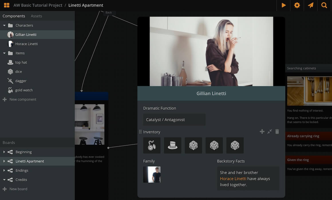
The attached components appear with their thumbnail. Click on the thumbnail to open the attached component.
Asset lists
Use asset lists when you need to attach an array of image or audio assets in an element on component.
✅ Elements already have their unique cover (image asset) and their attached audio clips (audio assets), which appear in Play Mode. Still, the asset list attributes allow you to add more image assets and audio assets, although they are not visible in Play Mode.
The image below shows an element with all 4 types of attributes.
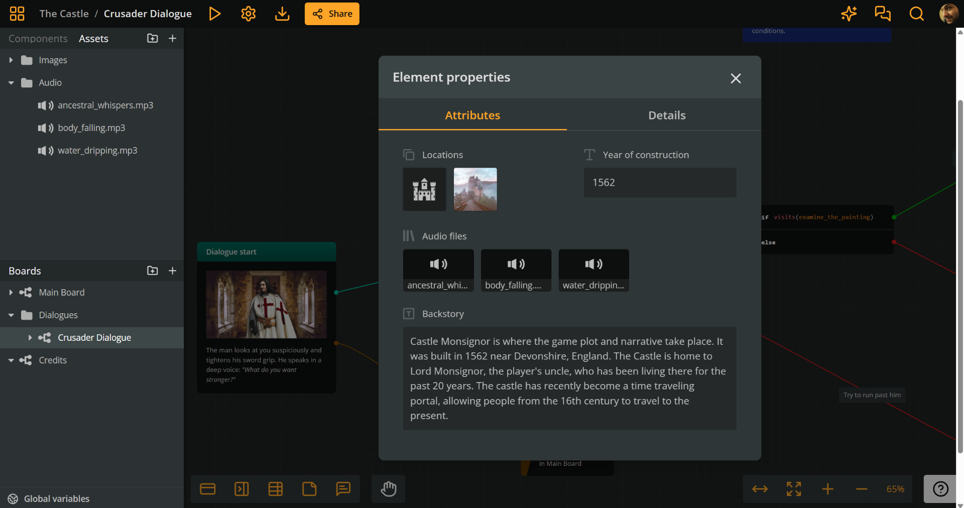
Attributes panel
To create, edit, or delete an attribute, first access the attributes panel.
Component attributes panel
To access a component's attributes, do the following:
- Locate the component:
- Sidebar: In the Components section
- Current board: In an element where it is attached
- Click the component to open its attributes panel.
Element attributes panel
To access an element's attributes, do the following:
- Locate the element on your board.
- Right-click the element and choose Properties.
- In the Properties modal, switch to the Attributes tab, to reveal its attributes panel.
Create attributes
Once in the attributes panel of a component or an element, follow the next steps to add a new attribute:
- If the component has no attributes, click the button that corresponds to the type of attribute you want to create.
- Otherwise:
- Hover the mouse cursor over an existing attribute.
- Click on the (+) icon at the attribute's top right corner.
- Select they type of attribute you want to create from the menu. The newly created attribute will appear above the clicked one.
Add to list attributes
Component lists
To add a component to a component list, do the following:
- Open the attributes panel of the relevant element or component.
- Locate the component list attribute you want to use.
- In the Components section of the sidebar, find the component you want to attach.
- Drag and drop it into the component list.
You can also reorder components within a list or move them between lists by dragging and dropping.
Asset lists
To add an asset to an asset list, do the following:
- Open the attributes panel of the relevant element or component.
- Locate the asset list attribute you want to use.
- In the Assets section of the sidebar, find the asset you want to attach.
- Drag and drop it into the asset list.
You can also reorder assets within a list or move them between lists by dragging and dropping.
Resize attributes
By default, attributes span the full width of the attributes panel, but you can resize an attribute to span only half-width and vice-versa.
To resize an attribute, do the following:
- Hover the mouse cursor over it.
- Click on the double arrow icon appearing at its top right part.
Reorder attributes
To reorder an attribute, do the following:
- Click and hold it from the dots icon, at their top left corner.
- Drag and release it above or below another attribute.
Deletε attributes
To delete an attribute, do the following:
- Hover the mouse cursor over it.
- Click on the trash can icon appearing at its top right part.